“Exit intent technology” sounds really cool, a lot of fanfare has been made about it and there are entire businesses that are based on creating exit-intent opt-in forms for your site (in some cases at an extremely high price)… and we’re about to show you why it’s completely overrated.
Exit intent is probably the most talked about and most widely used technique for list building right now. We’ve compiled some case studies that will change the way you think about it and give you more powerful tools to work with.
What Exactly is Exit Intent?
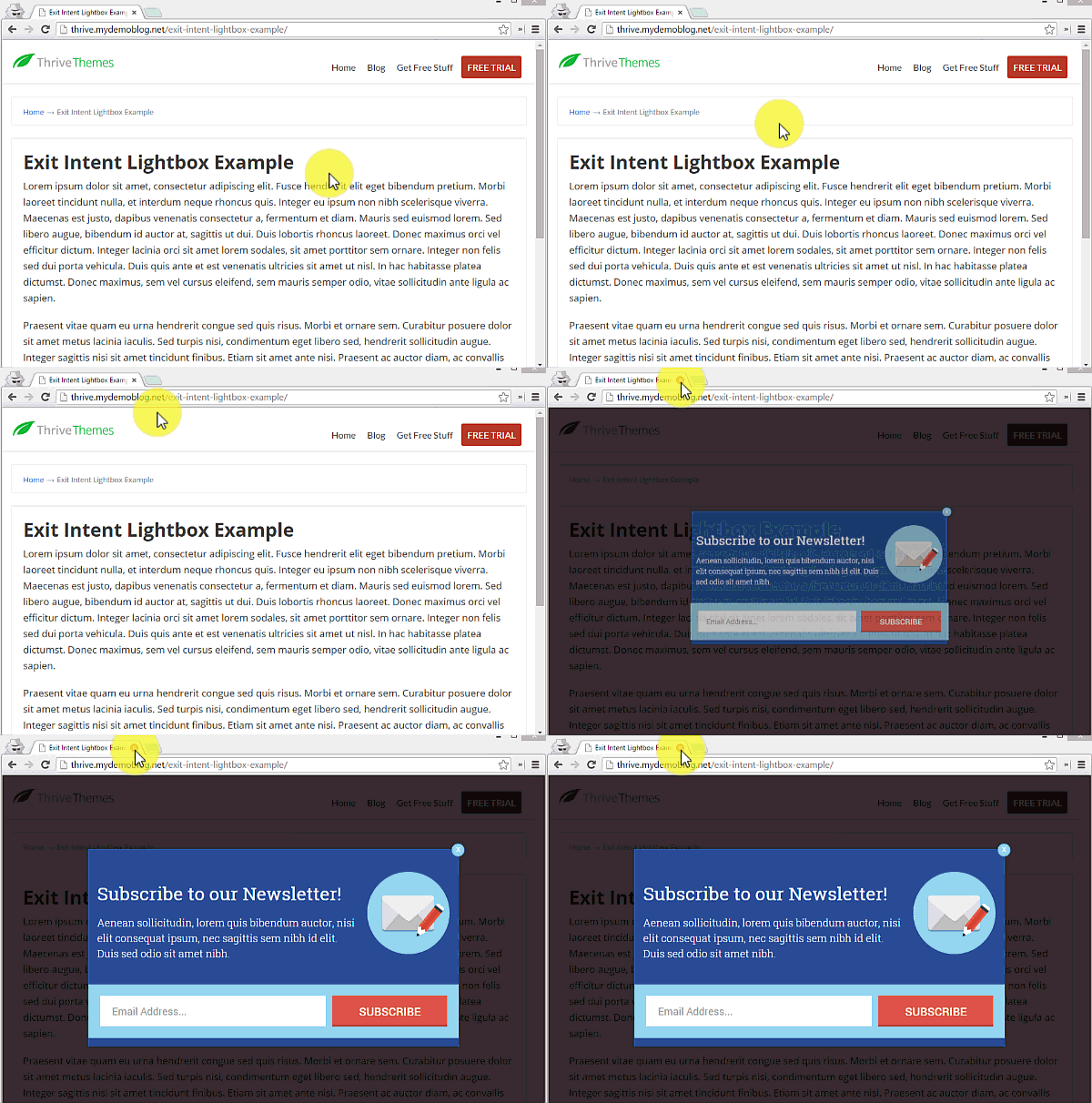
The basic idea is that you make an opt-in lightbox (sometimes wrongly called a ‘popup’) appear on your website the moment a visitor shows that they’re about to leave. Here’s what that could look like:

In this way, the opt-in form attempts to recover a lost visitor. The visitor has already decided to leave and you present an offer that can turn them into an email subscriber.
Exit Intent vs. Exit Redirect
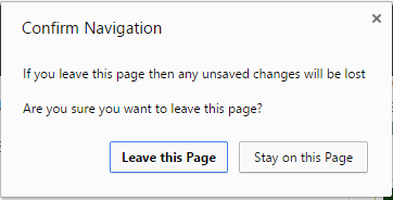
Note that there’s an important difference between an exit-intent form and what’s usually called an exit-redirect or exit-popup. An exit-popup is a browser warning message that is triggered when you try and close a tab. For example, if you make some changes in an online editor and try to close the tab, you’ll probably see an exit-popup that warns you about losing all your unsaved changes if you leave now.
While exit-popups can be used for marketing purposes, they can’t be used for lead generation directly. It’s not possible to prevent the closing of a tab and show a lightbox opt-in form instead. You can only show browser warning messages like this one:

Because of this, exit-intent is about tracking the movement of the mouse cursor to determine when a visitor is likely to leave, although there’s no way of knowing for sure that they were about to leave.
Why Exit Intent?
Now that we know what it is, the next question is: why has exit intent become such a popular tool?
It mostly comes down to a very simple and very persistent idea, which is:
“Lightbox opt-in forms are annoying!”
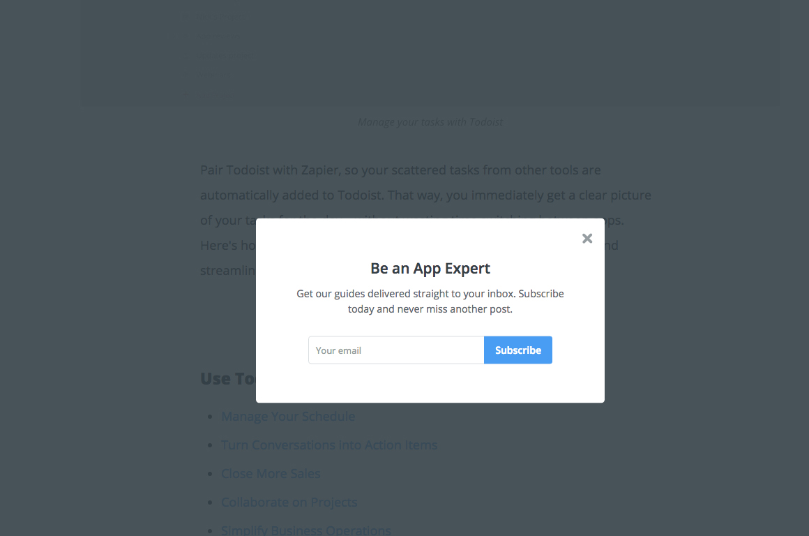
A lightbox opt-in form that triggers after a few seconds interrupts your visitor and can indeed be perceived as annoying. As a website owner, you might be very concerned about annoying your visitors and you might even have a deeply held belief that lightbox opt-in forms must perform badly because of how annoying they are.
The logic usually goes: “I don’t like lightboxes that interrupt me, therefore no one likes them, therefore they must be ineffective.”
On the other hand, marketers keep telling you that lightbox forms perform great and that you should use them.
Exit intent appears as the solution to this dilemma: you get to use lightbox forms, but in a way that doesn’t interrupt or annoy your visitors! It’s the perfect compromise! Or is it..?
The Redeeming Factors: When to Use Exit Intent
I could spend the rest of this post showing more test data where exit intent performs badly and continue to tear it down as a technique for list building. Instead, I want to make this more positive and useful, so we’ll examine when it actually does make sense to use exit intent. After that, we’ll look at some ways in which exit intent can be improved dramatically.
The ideal way to use exit intent can be summed up in one sentence: use it to promote secondary offers only.
List building tip: use exit intent for secondary offers only! Here are some examples to illustrate what this means:

Add a Lead Generation Offer to a Sales Page
On a sales page, you have a clear primary offer and conversion goal: you want visitors to learn about the product and then make a purchase.
On a sales page, it would be a mistake to interrupt a visitor with a time-delayed lightbox and an opt-in offer because getting the lead is secondary to making the sale.
However, using exit intent can be useful in this scenario. Instead of interrupting potential buyers, you show an opt-in offer only to visitors who were about to leave anyway. This gives you a chance to get their email address and then turn them into customers later on.

Offer a Coupon or Trial on a Sales Page
We have the same scenario as above: your visitor is looking at your sales material and you don’t want to interrupt them while they’re doing that.
Another way to try and save the sale when a visitor is about to leave is to show them a coupon offer or a trial offer on exit. In this case, the ideal outcome is that the visitor reaches the primary conversion goal, which is making the regular purchase at the full price. If they’re about to leave, you can advertise a secondary offer, like a lower-priced trial or a price reduction.
Both of these secondary offers aren’t as good for your business as the primary conversion goal, but they’re better than losing a visitor forever and that’s why using exit intent to make these offers is worth testing.


